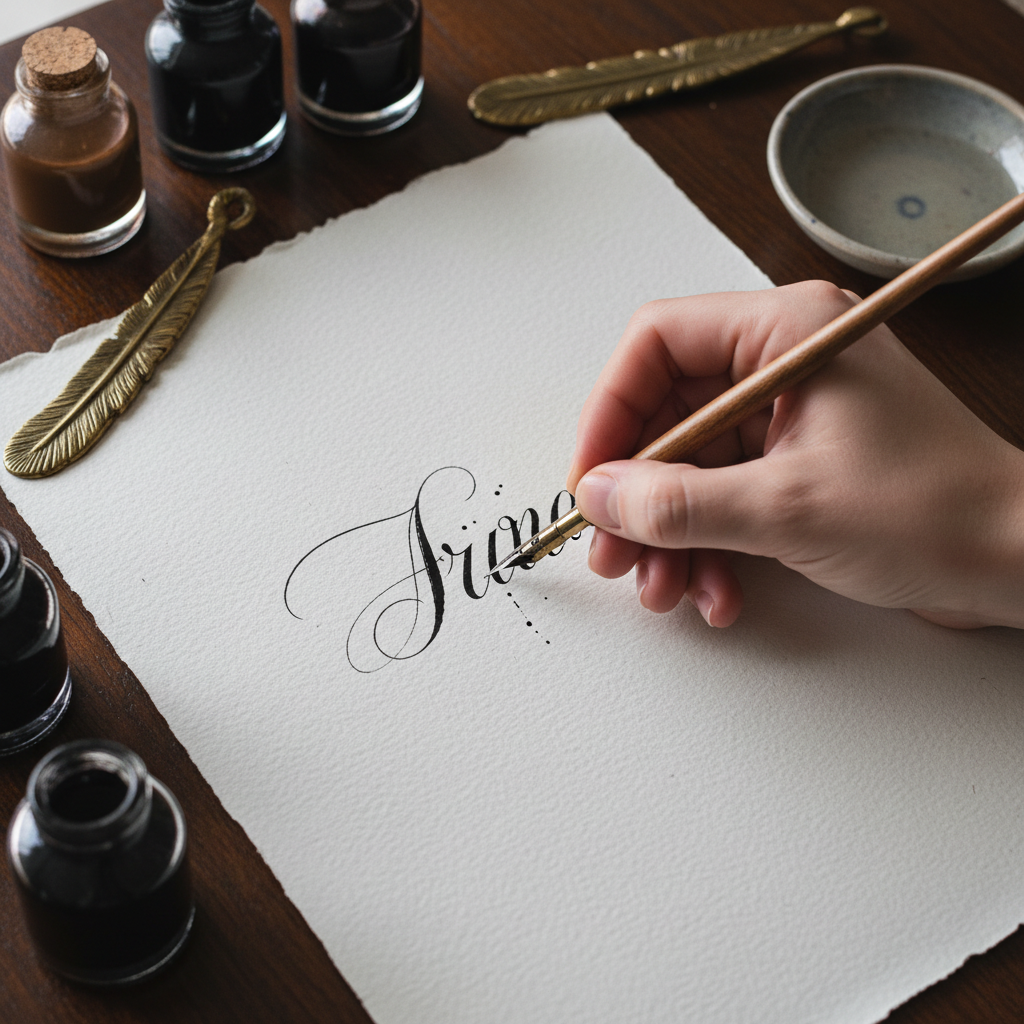
Flourish
A hand that turns ink into architecture


How this piece
was made
Chapter Headers & Title Lettering
For publishing houses that understand a book's first impression lives in its type
Commissioned for Meridian Press's limited collector editions — 48 hand-lettered chapter openings across three volumes. Each header designed to breathe with the prose that follows.


How this piece
was made
Human Hand in Digital Identity
For agencies that know a logo drawn by a person carries weight no algorithm can replicate
Maison Velour's rebrand needed something their digital team couldn't manufacture — proof of craft. The wordmark was drawn 140 times before the final version earned its vector trace. The imperfection is the point.


How this piece
was made
Envelope Art & Ceremony Lettering
For stationers who know that the envelope is the first act of the wedding
The Harrington-Osei wedding commission: 280 hand-addressed envelopes in pointed pen Copperplate, 12 place cards in Italic, and a 3-metre ceremony arch banner in brush script. Every name considered, every flourish earned.


How this piece
was made
Specimen Books & Collected Works
Where lettering escapes function and becomes its own subject
The Alphabet as Architecture series: 26 large-format sheets, each letter treated as a structural study. Walnut ink on Fabriano Artistico, each piece 56×76cm. Currently held in three private collections in London, Tokyo, and São Paulo.